
This is the project I wrote for the course Japanese Visual Culture, which I took this semester. The course is about:
Drawing upon recent theoretical work in visual culture studies, new materialism and affect theory, examine how technologies of viewing–from telescopes to magic lanterns, vitascopes to smartphones–have mediated the creation of images over time and enabled new modes of spectatorship.
Introduction
Music is more than just sound. While the auditory experience is undoubtedly the core of an album, other elements contribute to making an album truly iconic. Since the advent of the full-length album format, cover art has played a crucial role in shaping an album’s identity, adding a visual dimension to the music. From the elaborate gatefolds of the vinyl era to the compact liner notes of CD jewel cases and the minimalist icons on digital streaming platforms, album art has continuously evolved. However, its significance remains unchanged—it frames how listeners perceive an album before they even press play. Some covers embrace simplicity, while others are visually intricate, packed with details for fans to analyze. The imagery can range from photographic portraits and paintings to collages and abstract designs. Some covers feature the artist prominently, while others opt for symbolic visuals to immerse the audience in their world. Certain album covers have become more famous than the music itself, celebrated in pop culture, displayed in museums, and referenced in various media.
Methodologies
This project examines the album covers of J-Hip Hop to trace the evolution of visual representations in the genre from the 1990s to the early 2000s. To contextualize these changes, I will also reference hip-hop album art from the 1990s U.S. to highlight intertextual influences between Japan and the United States. The motivation for this study comes from previous works that explore how imagery shapes the sound and identity of hip-hop. Visual aesthetics are crucial in constructing cultural narratives (Tobak, 2018). Album covers function as visual representations of the music, embodying the themes and messages that artists aim to convey. Every artistic choice—the pose, attire, setting, and color scheme—contributes to the album’s identity. This study aims to further investigate these connections.
I will apply visual grounded theory to analyze the album covers, systematically examining each piece, identifying compositional elements, coding different aspects of the imagery (Konecki, 2011), and repeatedly analyzing the visuals to uncover emerging themes.
Cosmic Concept Rules


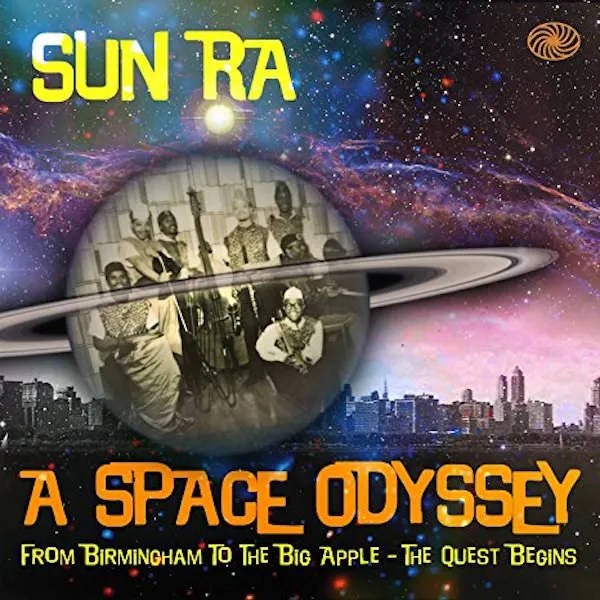
Figure 1 Mess/Age (1989) Figure 2 Fear of a Black Planet (1990) Figure 3 A Space Odyssey (1980)
For the first wave of 90s Japanese hip-hop, The Mess/Age album by Seiko Ito, released in 1989, is often cited as one of the pioneering works from the dawn of Japanese hip-hop. The album features Japanese rap that makes extensive use of Ito’s rhymes, combined with backing tracks that sample jazz, funk, calypso, Italian film music, and more. One of the samples includes Sun Ra, which might explain why the album artwork resonates with cosmic themes. The use of color and celestial elements is striking, with the central focus being an unusual depiction of a planet. In Figure 1, a large, bright orange planet is depicted with Mickey Mouse-like eyes, an animal-like (possibly large) nose, and a wide smile showing four teeth that resemble a window. The bright orange planet strongly contrasts with the dark blue background, making it the most noticeable element in the cosmic setting—perhaps symbolizing Japanese hip-hop itself. Additionally, the album title has orange underlining, further reinforcing the color contrast.
In contrast, Figure 2 shows the album cover of Public Enemy’s Fear of a Black Planet, released in 1990. A nod to the Afrofuturism of artists like Sun Ra, the artwork features a black planet embossed with the Public Enemy logo, slowly eclipsing Earth. The design of the album title text resembles the text style seen in Star Wars, adding to its interplanetary aesthetic. Compared to the bright orange planet in Figure 1, the black planet in Figure 2 appears much darker. The use of gold and red creates a melting effect, and the color combination also resembles a shooting target, visually reinforcing the album’s powerful concept.


Figure 4 スチャダラ大作戦 (1990) Figure 5 シン・スチャダラ大作戦 (2020)
Scha Dara Parr also had a huge impact on the 90s hip-hop scene. They released their first album, Scha Dara Daisakusen, in 1990 (Figure 4). For the album’s 30th anniversary, they released two different cover versions: one with a graffiti style and another with a science-fiction theme (Figure 5).In Figure 4, the artist’s name, “SDP” (Scha Dara Parr), is designed in bold yellow and red, giving the impression of being launched from Earth, which is depicted in blue—arguably the most common representation of Earth compared to the previous figures. The plain orange background complements the “SDP” text, drawing attention to the artist’s name rather than other elements. Scha Dara Parr originally emerged from the underground scene, so the album title, Scha Dara Daisakusen, can be seen as their response to the ongoing debate of “mass appeal vs. core authenticity” in the music industry.
The science-fiction-themed version evokes the aesthetic of 1980s–1990s tokusatsu productions—it looks like a scene straight out of Ultraman. In an unknown, secret location deep in a forest, massive unidentified objects have fallen from outer space, and a special search unit is investigating the site. Notably, in Figure 5, both the planet and the “SDP” text are rendered in silver, as if the original colors have faded over time. However, the search unit members wear yellow uniforms—the same color used in the 1990 album cover. This could symbolize the rediscovery of Scha Dara Daisakusen and its significance in Japanese hip-hop.
Attitude Comes First

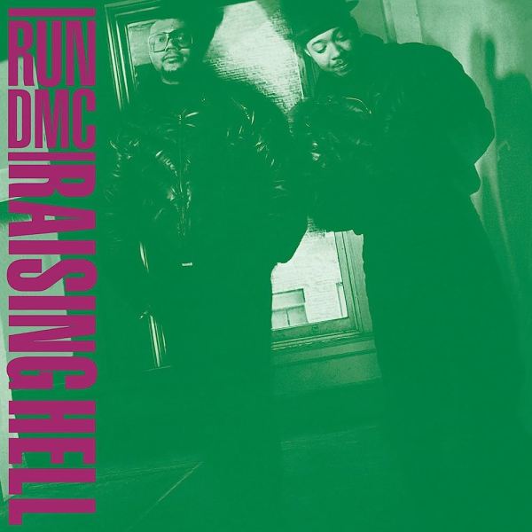
Figure 6 Paid in Full (1987) Figure 7 Raising Hell (1986)
Paid in Full by Eric B. & Rakim is considered a gold standard in album cover design (Figure 6). The cover features the duo standing in front of a cash-filled backdrop, draped in thick gold chains and flashing hands covered in gold rings—a raw symbol of their rise from the streets. But it’s not just about extravagance; the cover set the foundation for an aesthetic that defined hip-hop luxury in the late 80s and early 90s, making it a cornerstone of the genre’s visual identity (Figure 6).
Even before the release of Paid in Full, this style and attitude had already begun to emerge. In Figure 7, Raising Hell by Run-DMC features the trio dressed in their signature all-black suits—an iconic look. Both covers use green as the dominant color, symbolizing money, with contrasting red or purple text to create visual impact. The unified, bold fashion statements in these covers became synonymous with the artists, transforming their street style into a defining hip-hop aesthetic. This influence extended beyond the U.S., shaping the visual and cultural identity of Japanese hip-hop as well.

Figure 8 Enter the Wu-Tang (36 Chambers) (1993)
The cover of Enter the Wu-Tang (36 Chambers), released in 1993, features the Clan members in high-contrast black-and-white with flashes of yellow, their faces obscured by hoods and shadows. The artwork captures the group’s gritty sound and mysterious aura, while its stark, minimalistic aesthetic became a blueprint for countless East Coast rap albums that followed. Here, I want to highlight the use of photography focusing on faces—particularly the way entire groups’ faces are framed. I argue that this became an essential theme in hip-hop album art, serving as a powerful medium to convey the artist’s message and spirit. In the next section, I will explore this idea further.
Staring At You
The cover of N.W.A’s Straight Outta Compton (Figure 9), released in 1988, became a model for many later hip-hop photography styles. While other rap acts were cultivating tough or serious images at the time, Straight Outta Compton was unmatched in its raw intensity. The cover, shot from the perspective of someone lying on the ground, shows Eazy-E pointing a gun directly at the viewer while the rest of the group looms over them with a cold, merciless gaze. Grim and provocative, it remains one of the most iconic images in gangsta rap history, embodying the group’s raw and rebellious spirit. The downward gaze of the group reflects the album’s central themes of tension, aggression, and defiance against law enforcement and the establishment. A similar composition appears on the cover of The Roots’ 1996 album Illadelph Halflife (Figure 10). Though the color palette is darker and more muted, giving the album a somber, muddy tone, the central focus remains the same: the group members gathered together, staring directly at the camera.
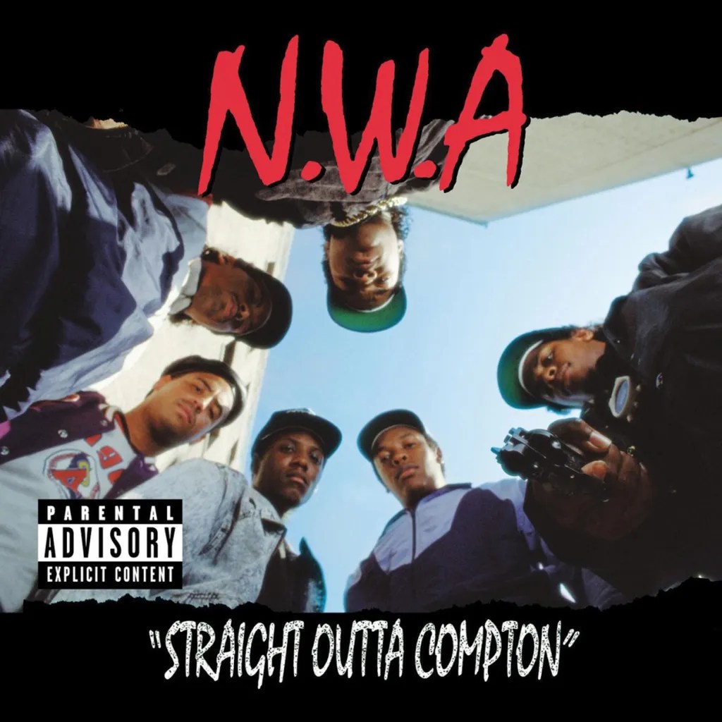

Figure 9 Straight Outta Compton (1988) Figure 10 illadelph halflife (1996)
In Japanese hip-hop, there seems to be a preference for a yellow-black color scheme. King Giddra’s debut album (Figure 11), released in 1995, continues the trend of focusing on the group members’ faces. The cover features the three artists, with two staring directly at the camera and one looking off to the side, possibly at the ground. The background is minimal, consisting of a single tree and a sky with white and slightly orange hues. On the left foreground, the artist’s name appears in bold gold and red, positioned where the sun would typically be. The group’s street-style clothing—caps and beanies—draws attention to their eyes and facial expressions, emphasizing their presence. This focus on facial expression isn’t random; it is always connected to the album’s theme, which I will explore in the next section.
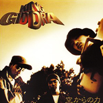
Figure 11 空からの力 (1995)
Calling on Social Issues
Because of its cultural roots, hip-hop is an ideal medium for addressing social issues. A prime example is the album cover of Things Fall Apart by The Roots, released in 1999. One of five original covers, the most iconic features a Civil Rights-era photograph of two Black youths running from police in riot gear in Brooklyn’s Bedford-Stuyvesant neighborhood—a powerful visual statement on the inequality the group sought to highlight through their music. The black-and-white image captures two Black women fleeing the police during a 1960s riot. Their palpable fear and anguish are heightened by their white dresses, which starkly contrast against the darker background. The album title, Things Fall Apart, is etched in blood red in a simple, clear font—a sharp contrast to the chaotic scene yet leaving no ambiguity about the gravity and despair it conveys. The concept of ‘visual failure in society’ paired with an album titled Things Fall Apart feels deeply intentional. It stands as a visual testament to The Roots’ boldness, political consciousness, and their use of music as a platform for social commentary.

Figure 12 Things Fall Apart (1999)
Naturally, the social issues in the U.S. and Japan are apparently different. Just like the gansta rap in the west coast of U.S. that include elements such as gangs, guns, drugs, and marijuana that may seem real to the U.S. audience, but are they real in Japan? I think various Japanese hip hop artists gave their own version of answers to these questions by exploring the everyday life of Japan.
Faceless Street Youth
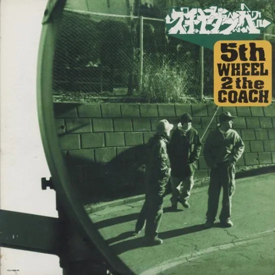
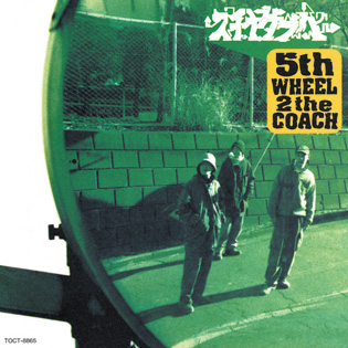
Figure 13&14 5th Wheel 2 The Coach (1995)
Scha Dara Parr released their fifth album, 5th WHEEL 2 the COACH, in 1995, showcasing both their playful side with free-flowing ideas and their serious side in hip-hop. They actually shot both front-facing and reversed versions of the album cover, but the final jacket design features the members with their backs turned to the camera rather than facing it, which gives the album a more melancholic vibe. We, as the audience, view the artists through a caution mirror, the kind commonly seen on highways. The group members stand in front of the road, neither looking at the camera nor the mirror. Their shadows blend seamlessly with the background, which immediately caught my attention. The three members, simply standing on the road doing nothing, remind me of childhood moments spent aimlessly hanging out with friends. Their street-style clothing aligns well with the album’s overall concept. In Figure 14, a revised version of Figure 13, the group members have turned their backs to the front. It’s hard to determine whether they are looking at the camera or not, but compared to Figure 13, they are now facing the opposite direction, making viewers wonder what they are looking at. This album includes a track called B-Boy Bungaku, which reflects their deep thoughts and self-awareness—something that is also evident from the album covers.

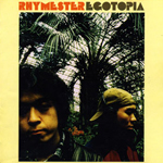
Figure 15 The Rhyme Animal (1998) Figure 16 EGOTOPIA (1995)
In Figures 15 and 16, the background is set against large tropical trees. In the zebra-themed image (Figure 15), it is difficult to determine whether the setting is indoors or outdoors, whereas in the Rhymester image (Figure 16), the environment appears more distinctly indoors. The dominant color tones in both images are yellow and green. Additionally, there is a noticeable distance between the artist and the camera, which, in a broader sense, also creates a sense of separation between the artist and the audience.
Looking back and keep forward
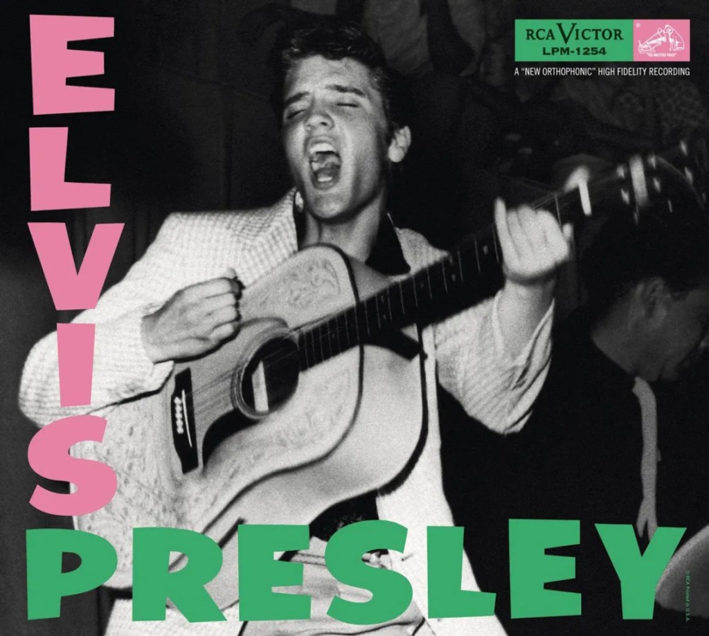
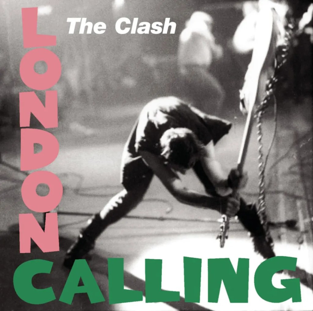
Figure 17 Elvis Presley (1956) Figure18 London Calling (1979)
A combination of green and neon pink first appeared on the album cover of Elvis Presley, released in 1956. Later, London Calling paid tribute to Elvis Presley while also reinventing rock ‘n’ roll through The Clash’s own explosive style. The pink and green title letters on London Calling mimic the typography of Presley’s 1956 self-titled album

Figure 19 The Rhythm.The Rebel (1992)
In Japan, the same green and neon pink combination appeared on DJ DOC. HOLIDAY’s The Rhythm. The Rebel., a fusion of hip-hop and rock. This mix of genres may explain why the album cover design pays homage to Presley’s 1956 release. The colorful text on the covers strongly contrasts with the monochrome backgrounds. Except for Elvis Presley, the other two albums obscure the artists’ faces from the audience, with a slight blur effect that further enhances the prominence of the vibrant title.
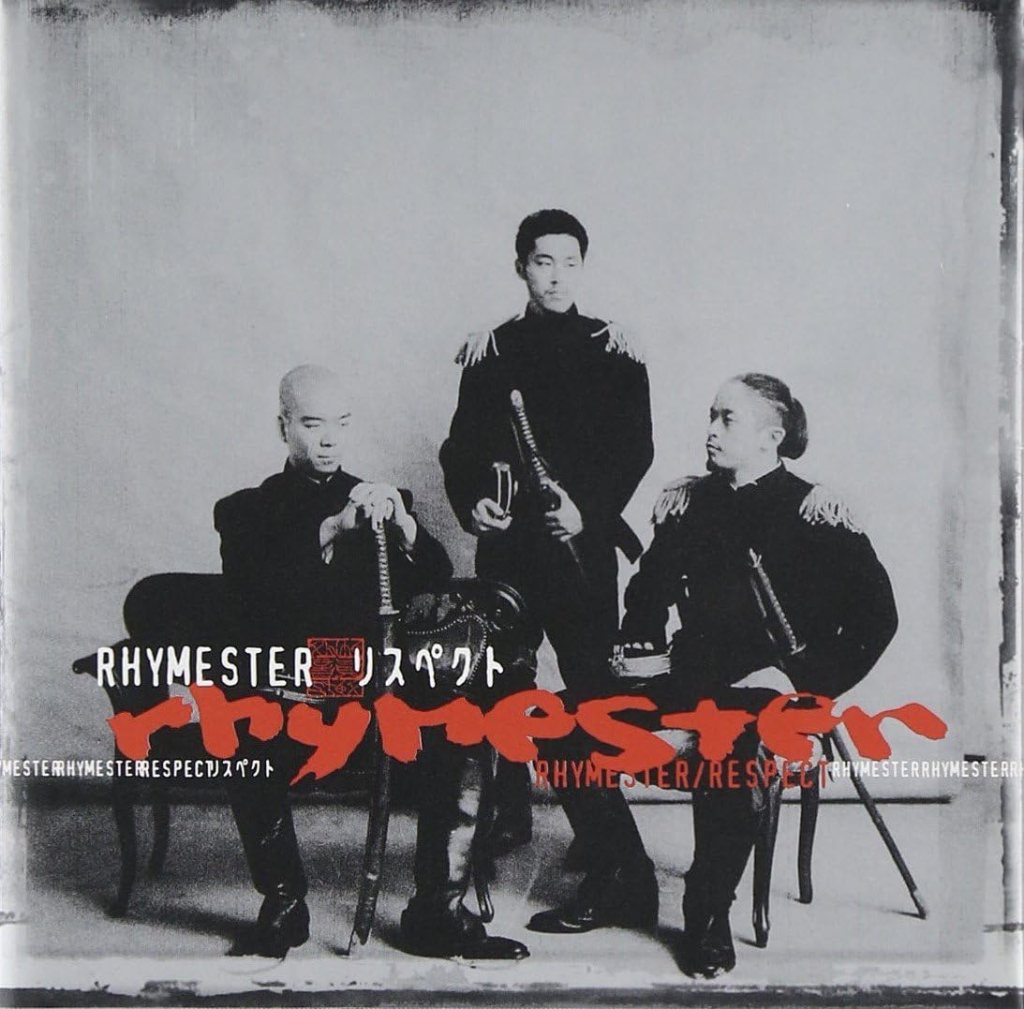
Figure 20&21 リスペクト(1999)
Lastly, Respect, an album by RHYMESTER, was released at the end of the century in 1999.The composition resembles a formal portrait, with two men seated on luxurious Western-style chairs and one man standing still. They are all dressed in black, military-style uniforms and holding long swords. None of them are looking at the camera or at each other, and their expressionless faces create a serious, almost solemn atmosphere. The image is in monochrome, except for the album title and artist’s name, which are in red. Given the military uniforms and swords, it’s hard not to associate this red with blood. The entire scene conveys a sense of seriousness and power.
Conclusion
Album covers contribute significantly to our perception of an album as a whole. They are constructed using photography, collage, or painted images, often combined with text placed over or within the visuals.
What intrigues me most about album covers is how they can alter the mood and even the meaning of a song by providing a different context. While this is true to an extent, one undeniable way to show the impact of album art is by examining how much the color scheme of a record cover influences its mood. Album art is an essential part of a band or album’s identity. These artworks don’t just define an album; they define an era, a movement, and an attitude that continues to resonate today.
Through these album covers, we can see the growing influence of Black culture. As Ian Condry (2006) notes, “The ‘Blackness’ of hip-hop in Japan is central to its cultural meaning. It is a Blackness that operates differently outside of mainstream U.S. culture.” Japanese rappers are expected to honor the African American roots of hip-hop while also creating something uniquely authentic and original.
This highlights how hip-hop iconography resonates in striking ways. Even though album covers do not produce sound themselves, they are profoundly musical. They represent the music contained within them and actively shape our listening experience. Conversely, our visual experience is influenced by the music. As W.J.T. Mitchell (2005) argues, “There are no purely visual media, as all media are mixed media.” Similarly, we can say there are no purely sonic media—album covers exemplify the audiovisual interplay that defines the experience of recorded music.
Notes
All the images of album covers (Figure1—Figure 21) are from Discogs
References
Condry, I. (2006). Hip-hop Japan: Rap and the paths of cultural globalization. Duke University Press.
Gray, J. (2010). Show sold separately: Promos, spoilers, and other media paratexts. New York University Press.
Kanesaka, E. (2022). Racist Attachments: Dakko-chan, Black Kitsch, and Kawai Culture. positions, 30(1), 159-187.
Konecki, K. T. (2011). Visual grounded theory: A methodological outline and examples from empirical work. Revija za sociologiju, 41(2), 131-160.
Tobak, V. (2018). Contact High: A Visual History of Hip-Hop. Clarkson Potter.
J.T. Mitchell (2005). There Are No Visual Media,” Journal of Visual Culture 4, no. 2, 257–66.
ジャパニーズHIP HOPの歴史年表 (1985年~2009年)
これで分かる日本語ラップ-90’s編-(プレイリスト付き)
https://note.com/2pine/n/n8a7a9490f5a5
The 100 Best Album Covers of All the Time
